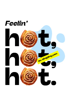
With India’s dessert industry growing at nearly double-digit CAGRs, standing out is no cakewalk. DBS Ventures saw an opportunity to create more than just another dessert cafe, they wanted to redefine the experience into something more playful, personal, and full of flavour, both on and off the plate. Not just a place to grab a bite, but a space that sparks joy, builds community, and makes you want to stay long after the last bite. A brand that doesn’t just compete on taste, but wins hearts through taste, storytelling, and soul.
Enter P.U. Dingding — a brand dreamt up to serve joy by the slice and brew. The brainchild of Kuncheria Marattukalam, the one who envisioned a space where desserts, coffee, and good vibes come together, he brought together pastry chef Nakul Kulkarni and coffee farmer-curator Aiyappa KT — two creative forces with wildly different personalities but a shared love for cake, coffee, and chaos (the good kind!). The result? A warm and unique space that brings joy and an irresistible dopamine rush. Think lazy Sunday afternoons chilling with friends and family. Singing loudly. Swapping stories. Gentle squabbles. Insider jokes. Stealing the last bite of cake. Living the good life.
The name P.U. Dingding is a playful misspelling of ‘pudding’ with a twist. ‘Dingding’ evokes the sound of a bell, a game show win, or an ice cream truck jingle—to cue feelings of joy and indulgence. The name immediately conveys lightheartedness and an invitation to play.
To bring that same energy to life, we whipped up a logo inspired by a cupcake: stacked, sweet, and topped with a cherry for good measure. It's soft, double-decker form has just the right mix of structure and silliness, like a dessert that’s both fancy and fun. With a dash of childlike charm and a whole lot of personality, it’s designed to feel instantly familiar. It’s the kind of logo that will bring an instant smile to your face.
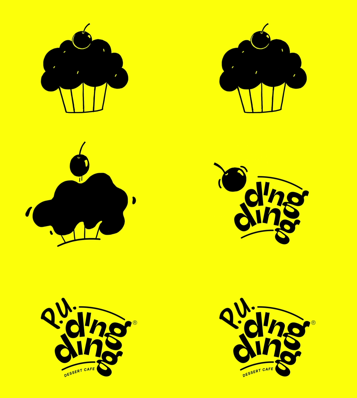
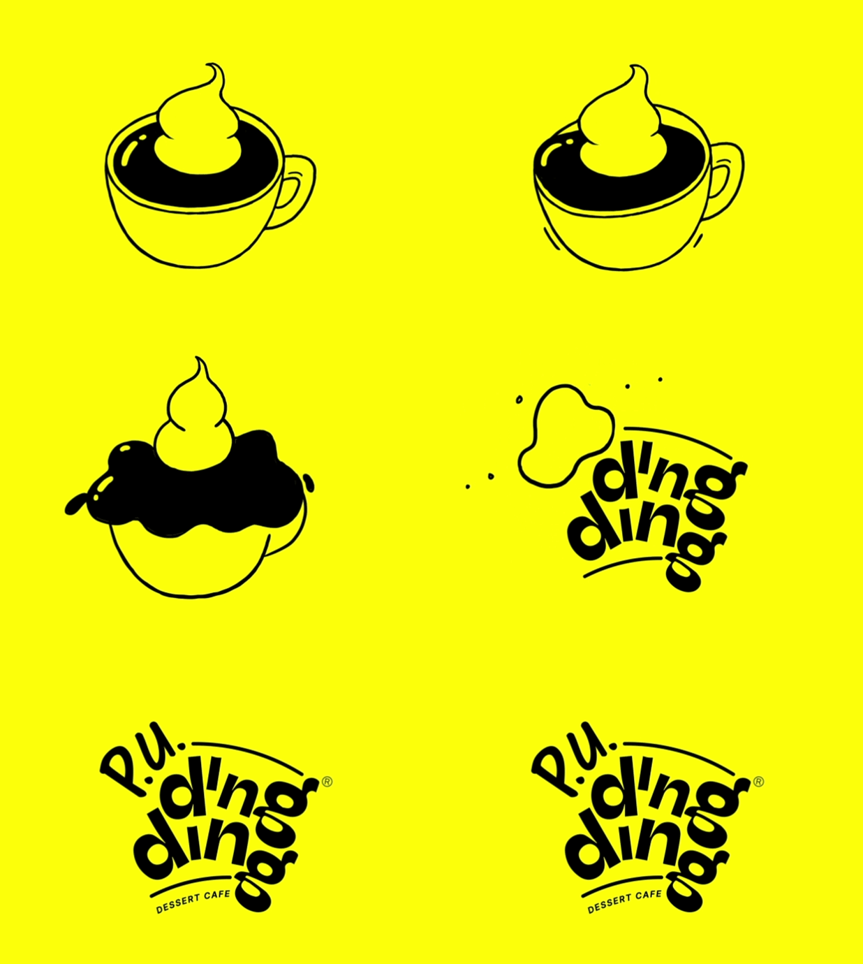
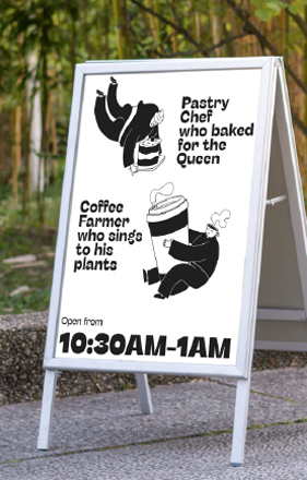
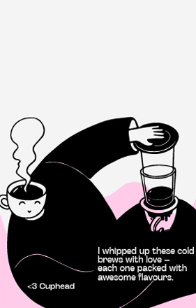
Cakehead and Cuphead — the brand mascots of P.U. Dingding represent the two co-founders with polar-opposite personalities. Cakehead is a globe-trotting, extroverted pastry chef with a gift of gab. He’ll tell you all about the tea parties he’s hosted for the Queen, desserts he’s crafted for the BAFTA dinner, or how he’s buddies with Brian Lara. Cuphead, on the other hand, is the opposite—a quiet coffee farmer from Kodagu who thrives in nature and enjoys his own company, literally serenading and sensing plants and animals. What they have in common is their culinary passion and a lust for life.
Cakehead’s got a cupcake for a head and is always caught in a whirlwind of whisks, sugar swirls, and plated desserts. Cuphead, with a coffee cup for a head, is usually busy sniffing beans, pouring the perfect brew, or just vibing with his plants. Together, they bring the brand’s flavour to life, one pastry and pour at a time.
Visually, these illustrations served a variety of functions in most delightful ways: carrying the brand’s joyful spirit, adding flavor to the storytelling, and making our mascots instantly recognisable. But more importantly, they gave the brand a beating heart, turning two culinary creators into characters people connect with.
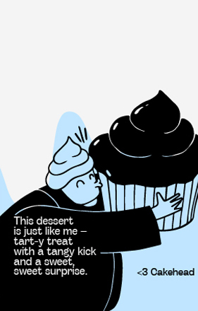
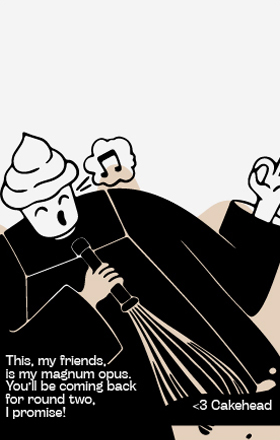
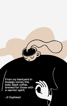
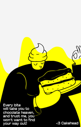
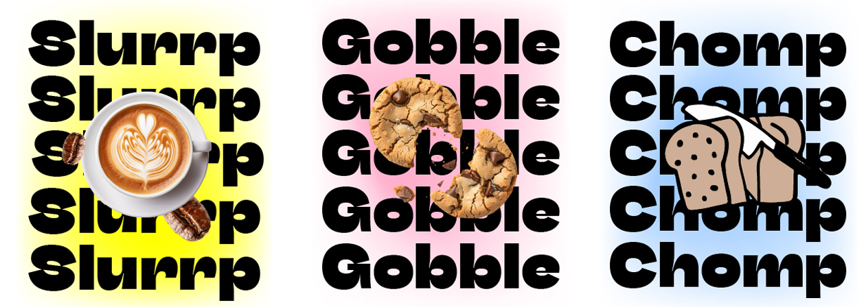
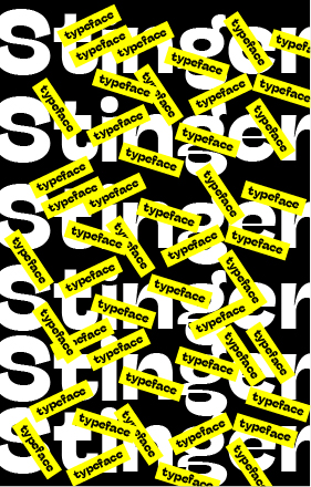
The design system was crafted to feel expressive, flavorful, and distinct — like a visual sugar rush you want to indulge in. Typography played a key role in setting the tone. We paired Stinger — with its bouncy, animated curves — with Inter, a crisp sans-serif that kept things clear and grounded. Together, they let us dance between loud, energetic headlines and warm, friendly copy, all while staying on-brand.
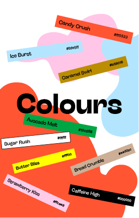
The core color palette kept things simple but sunny: classic black and white, plus a punchy yellow that radiates good vibes. Then came the flavour pops, a supporting cast of colours inspired by desserts themselves. Think caramel swirl browns, candy crush reds, to strawberry kiss pinks, sprinkled into product-focused storytelling.
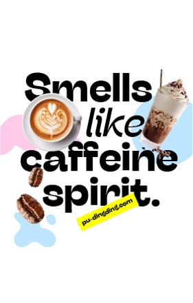
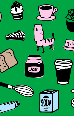
Visually, the dynamic identity comprises many parts – illustrated mascots, whimsical doodle-icons of cafe and bakery tools, spill-&-drip motifs that mimicked icing, froth, and drizzle— paired with drool-bait imagery, and a bank of remixed song lyrics with fun puns.
Sitting contrary in this sugar-free, diet-watching era of restraint, P.U. Dingding champions indulgence. The brand is always coaxing you to jam and binge.
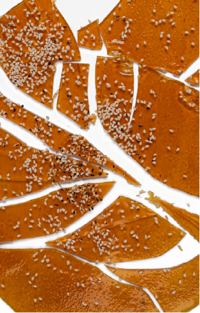
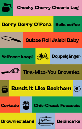
The real magic of P.U. Dingding came alive at the cafe itself, where people could see, touch, taste, and truly feel the brand in action. We wanted every little detail in the space to echo the same joy and warmth we’d baked into the identity.
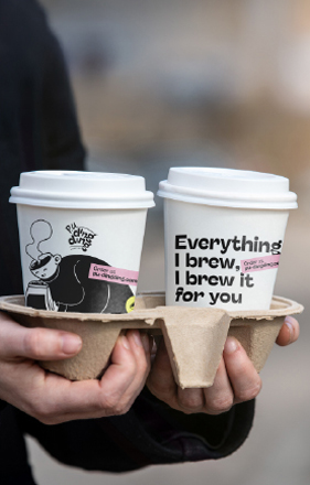
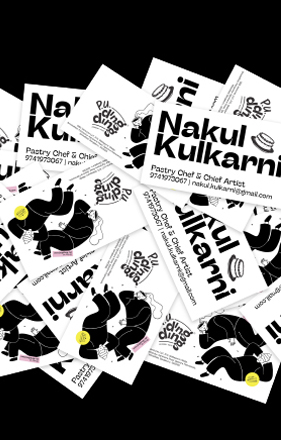
The cafe was designed to be a burst of happiness within a larger space, with illustrated accent walls, cheerful messaging, and cheeky signage that made the whole setup feel full of personality. Everything customers came in contact with, coasters and menus, staff uniforms, badges, and flyers, was designed to carry the same cheerful energy. Packaging got extra love, of course. With punny one-liners and vibrant visuals, unboxing a dessert from P.U. Dingding felt like unwrapping a present — a sweet little ritual you’d want to repeat again and again (and again and again).
Online, the P.U. Dingding universe just kept growing. Instagram became our little corner of the internet where desserts and coffees looked too good to scroll past, mascots made mischief, and behind-the-scenes moments felt like a peek into the kitchen. The feed was a mix of drool-worthy shots, pun-filled captions, and reels that told sweet stories (and often sparked cravings).
The result? More than just coffee and cake, the cafe is earning brand love for its generous servings of nostalgia, connection, and feel-good moments that keep people coming back for more. In fact, fans are so smitten with the brand identity, they’re asking for merchandise to take home! Thanks to the success of the launch, P.U. Dingding is all set to level up, with standalone stores and celebration cakes planned in the next 2 years.
